Changelog
- Feature New "Collection Preview" section
- Improvement Redesigned page list in admin area sidebar
- Improvement Improved responsiveness of page list in admin area sidebar
- Improvement New page creation menu
- Improvement Added the ability for spacer sections to remove space between adjacent sections.
- Improvement Added the ability to define thumbnail aspect ratios for "grid" gallery and collection layouts (Thanks, Sébastien!).
- Improvement Added "map" icon to social media links (Thanks, Tony!).
- Fix Fixed issue with a 404 error being showed sometimes after a page's slug is edited (Thanks, Ioannis!).
Changelog
- Feature Drop-down menus
- Feature New button section
- Feature Added the ability to collapse subpages in the admin sidebar, to make managing sites with a large number of pages easier.
- Improvement Added feedback when dragging-and-dropping pages, to inform of which pages types are allowed to be nested and which aren't.
- Bugfix Fixed issue that prevented the "open in new window" option from working for some links (Thanks, Victoria!).
- Bugfix Improved mobile formatting for collections when large margins are used on desktop.
Collapsible Page Groups
Sometimes it's the small details that make all the difference. If your site has a lot subpages, you'll be happy to know that you can now collapse and expand page groups in the admin area. This makes it much easier to navigate and manage your pages, especially if you have a lot of them.
Changelog
- Feature Added a new option to change the title position for "collection" sections.
- Improvement Greatly-improved the reliability and speed of large GIF images (Thanks, Andrew!).
- Improvement Improved admin formatting so toolbars don't cover image lightbox controls (Thanks, Kevin!).
- Improvement Improved internal architecture to allow for faster and more easily-maintainable "sections".
- Bugfix Fixed issue that caused page tags to show up too many times in collection tag menus (Thanks, Sébastien!).
- Bugfix Fixed an issue that caused the mobile header of the "Canyon" theme to be too wide in some cases (Thanks, Justin!).
- Bugfix Fixed issue that could cause changes to themes and layouts to appear not to save and revert to previous state.
- Bugfix Fixed issue that sometimes caused "spread" sections to stop working.
Changelog
- Improvement Updated the image lightbox with the ability to browse images from adjacent image galleries, without the need to exit and re-open (Thanks, Elaine!).
- Improvement Added the ability to have links open in new windows (Thanks, Koji!).
- Improvement Introduced caching system to the admin area to ensure the latest assets are always used.
- Improvement Privacy policy updated to reflect the reduction in 3rd party services used to provide our service.
- Bugfix Fixed issue with editing links that prevented the correct properties from showing up.
- Bugfix Fixed issue that prevented image limits from being raised in some cases.
- Bugfix Fixed issue that prevented link titles from updating in some cases.
Changelog
- Feature New migration tool to assist in moving a website from V1 to V2.
- Improvement Increased the threshold for data density before a PNG file is automatically converted to a JPEG.
- Improvement Added Mastodon and Threads to social media links/icons.
- Improvement Improved responsiveness of the "Hide Page" checkbox.
- Bugfix Image caption live previews made to support line breaks.
- Bugfix Fixed issue that prevented link titles from updating in the sidebar when edited.
- Bugfix Fixed issue that caused pages to disappear in certain cases.
Changelog
- Improvement Improved the title of links shared via text message and social media (Thanks, Brent!).
- Bugfix Fixed issue that causes drop down menus to stop working in some cases on V1 websites.
- Bugfix Fixed issue with dragging of images being offset in Firefox and Edge browsers (Thanks, Alex!).
- Bugfix Fixed issue with live preview area's scrollbar being inaccessible on Windows computers (Thanks, Roman!).
- Bugfix Fixed an issue that caused custom robots.txt content to be erased (Thanks, Christian!).
Design Overhaul

The most unique feature of 22Slides has always been its boldly-streamlined user experience. It's simple, straightforward, and free of unnecessary complications.
With the release of V2, we doubled down on our minimalistic approach, fundamentally changing almost everything, both to better match people's expectations of how a website editor should work, and to provide a solid platform to support new features for years to come.
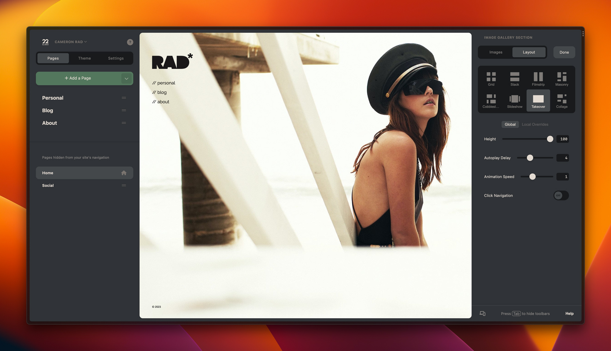
Now, roughly a year after V2's debut, we've just introduced a significant user interface update. This release greatly refines many of those decisions that make V2 great, and reimagines some others that were holding things back.
Improved page management
Now, you can easily see all the pages on your site at once, and drag them around to exactly where you need them to be, moving them between the main navigation and subpages. Jumping between sections and control panels to move pages around is no longer required.
A new, yet more familiar-feeling design
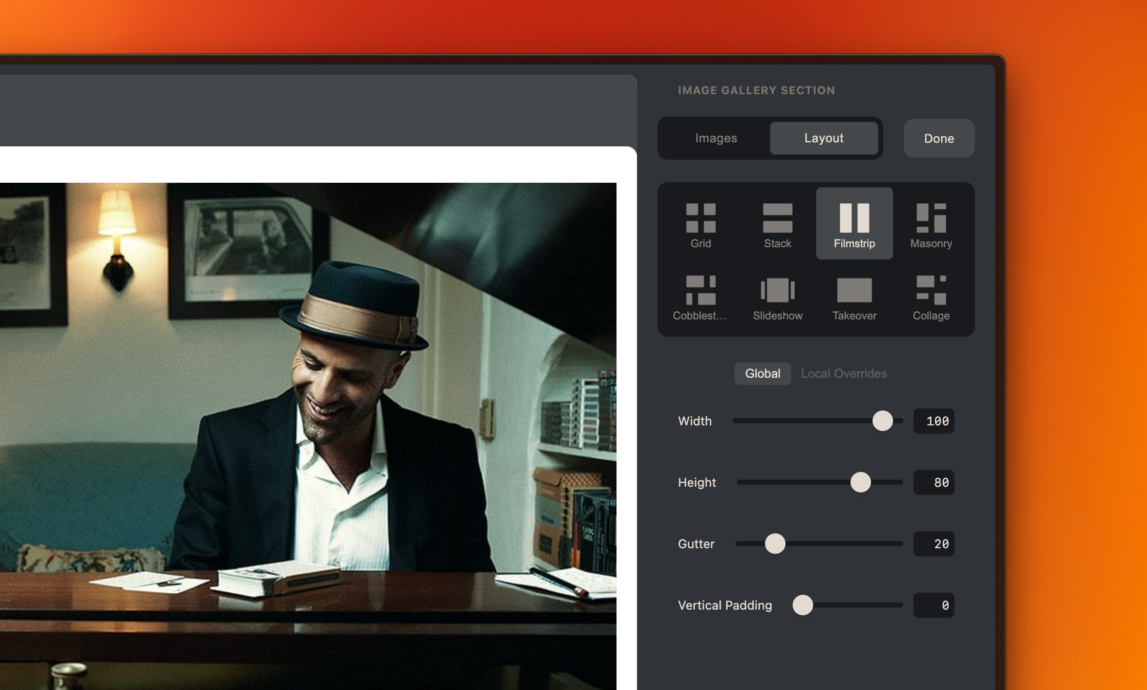
We redesigned many elements of the admin area to both better utilize negative space and adhere to common design patterns. Our tabs, form inputs, and other elements now look more refined, more familiar, and allow for more space for actual content.

Smoother workflows
Aesthetics aside, we also made major improvements to overall usability. Now you can select elements, make changes, and move on to the next task without losing your place.
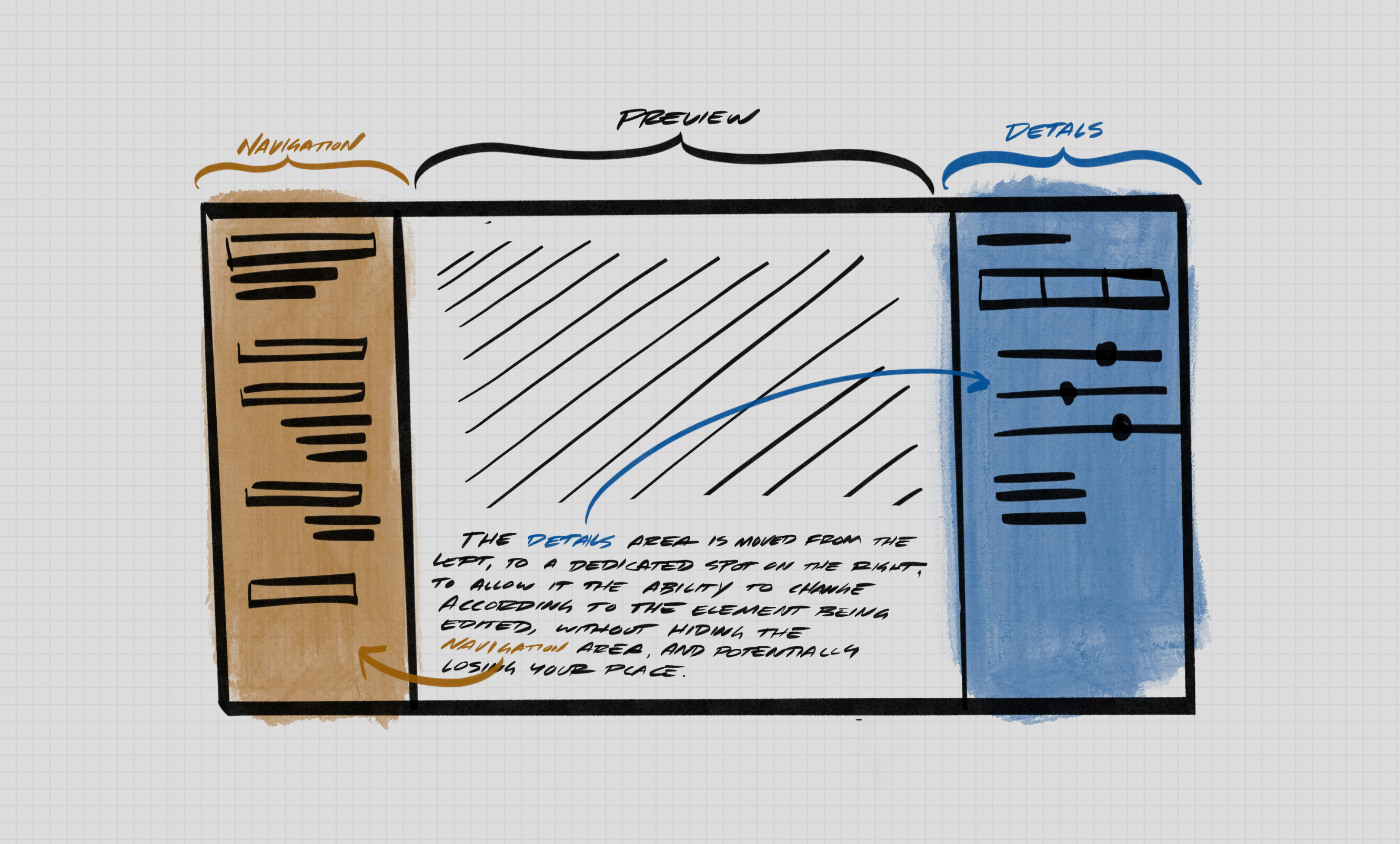
Previously, the single sidebar had to constantly change with the current task. This was disorienting at times, making it easy to get lost.
We introduced a second sidebar on the right side, which allows for more familiar workflows with navigation on the left, the canvas in the center, and details on the right, similar to Adobe Lightroom, Sketch, or most popular photography and design applications.

Changelog
- Improvement Improved the admin UI for smaller (<15") monitors.
- Bugfix Fixed issue that prevented new section menu from showing up on smaller monitors (thanks, Liang!).
New 'Strata' Theme

Our new 'Strata' theme is now available. Designed to be a more traditional-style option used for simple sites without a lot of photo content, such as events or invitations, it features a compact design that can help a website look "finished" even if its content may be lacking.
You can try it out by creating a new website and choosing "Strata" from the options, or by switching to it from the "Theme" tab in an existing website's settings.