Design Overhaul

The most unique feature of 22Slides has always been its boldly-streamlined user experience. It's simple, straightforward, and free of unnecessary complications.
With the release of V2, we doubled down on our minimalistic approach, fundamentally changing almost everything, both to better match people's expectations of how a website editor should work, and to provide a solid platform to support new features for years to come.
Now, roughly a year after V2's debut, we've just introduced a significant user interface update. This release greatly refines many of those decisions that make V2 great, and reimagines some others that were holding things back.
Improved page management
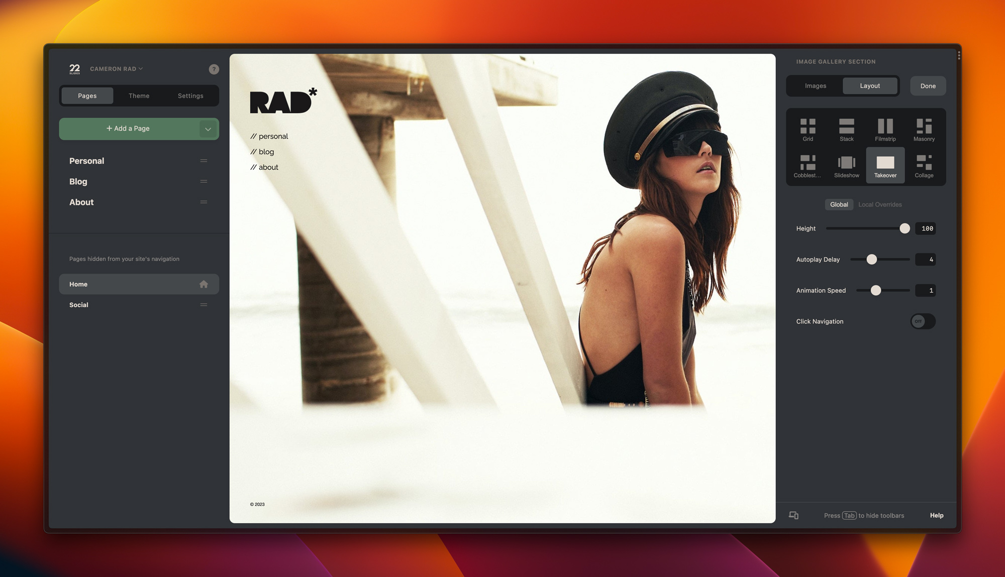
Now, you can easily see all the pages on your site at once, and drag them around to exactly where you need them to be, moving them between the main navigation and subpages. Jumping between sections and control panels to move pages around is no longer required.
A new, yet more familiar-feeling design
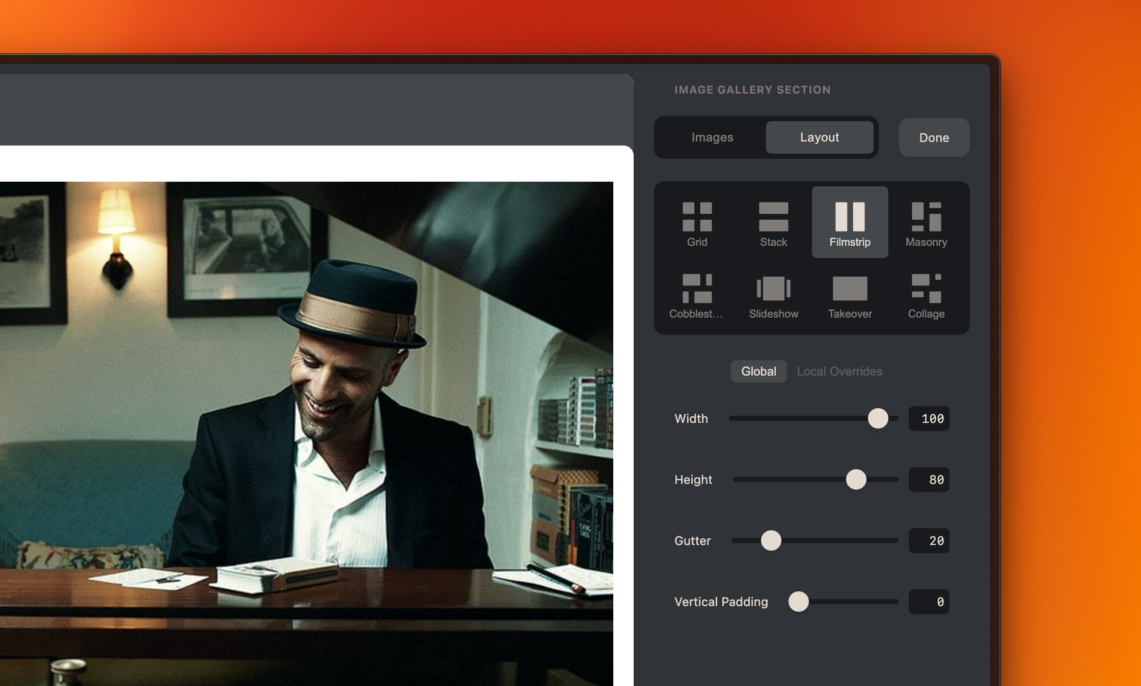
We redesigned many elements of the admin area to both better utilize negative space and adhere to common design patterns. Our tabs, form inputs, and other elements now look more refined, more familiar, and allow for more space for actual content.

Smoother workflows
Aesthetics aside, we also made major improvements to overall usability. Now you can select elements, make changes, and move on to the next task without losing your place.
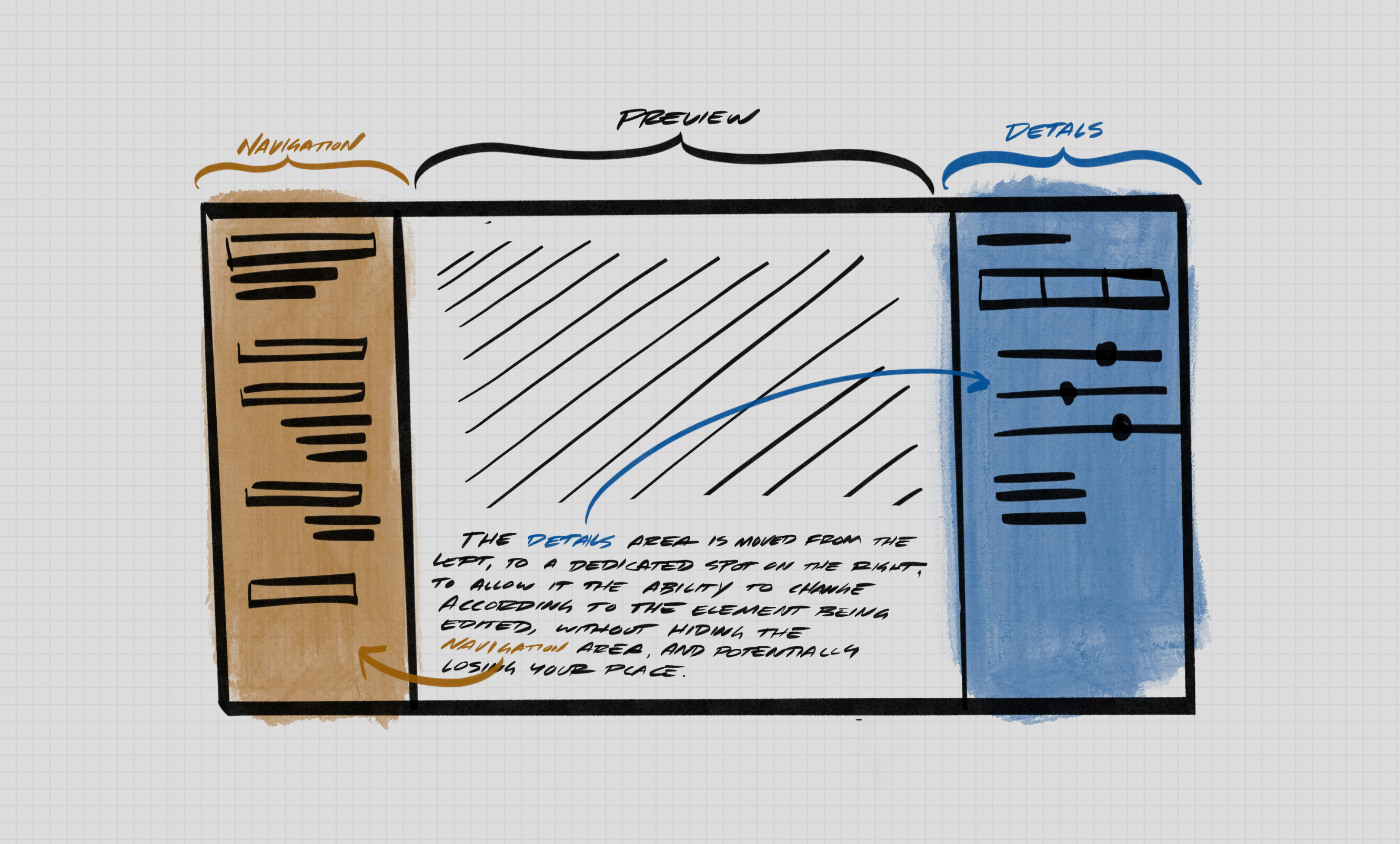
Previously, the single sidebar had to constantly change with the current task. This was disorienting at times, making it easy to get lost.
We introduced a second sidebar on the right side, which allows for more familiar workflows with navigation on the left, the canvas in the center, and details on the right, similar to Adobe Lightroom, Sketch, or most popular photography and design applications.
